
Arranging Paper Flowers into Eye Catching Designs
Sep 02, 2022
Once you’ve fallen in love with paper flower making, learning how to arrange flowers is a natural next step. You want to display those beautiful blooms in a way that showcases your creations and catches the attention of viewers.
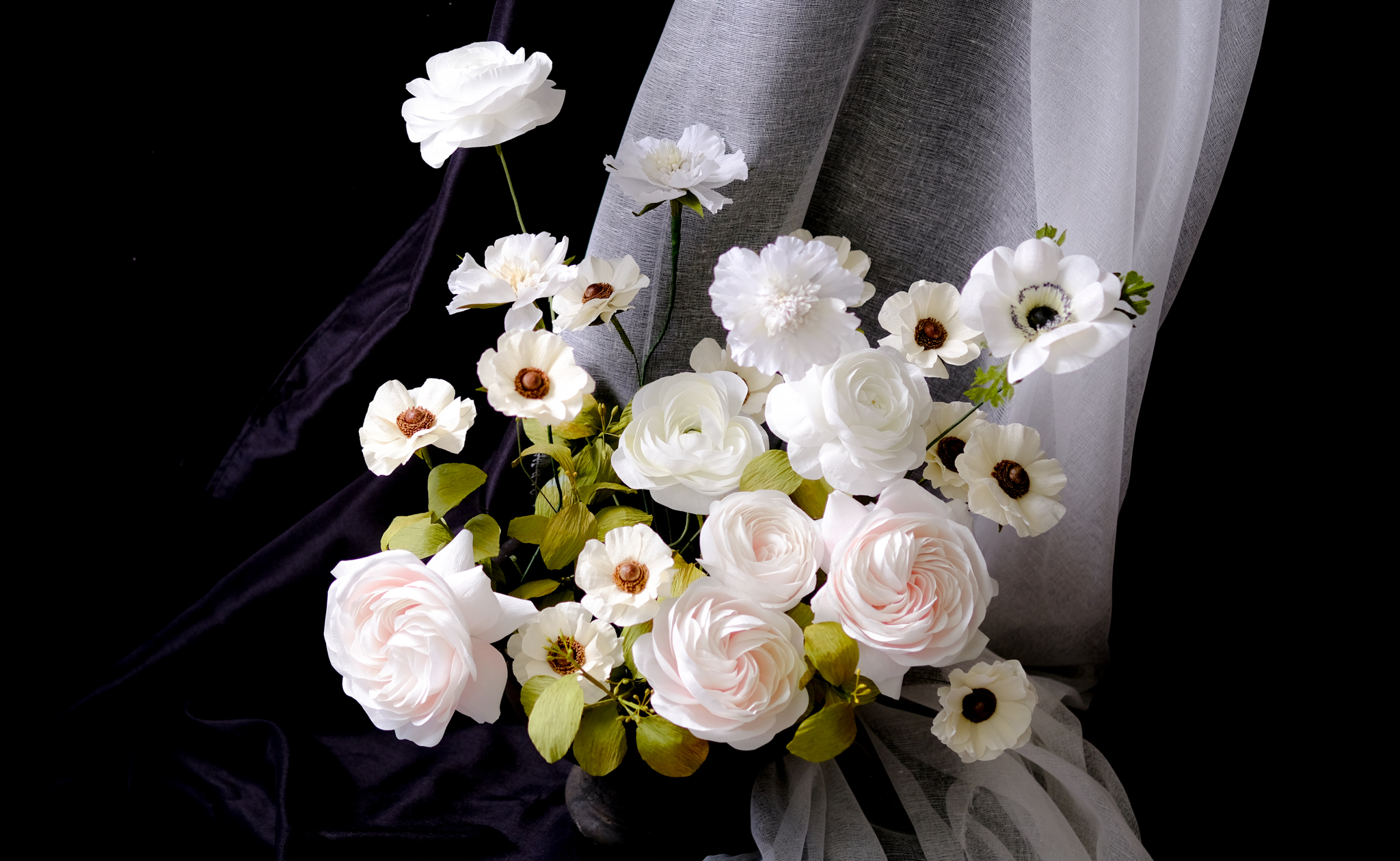
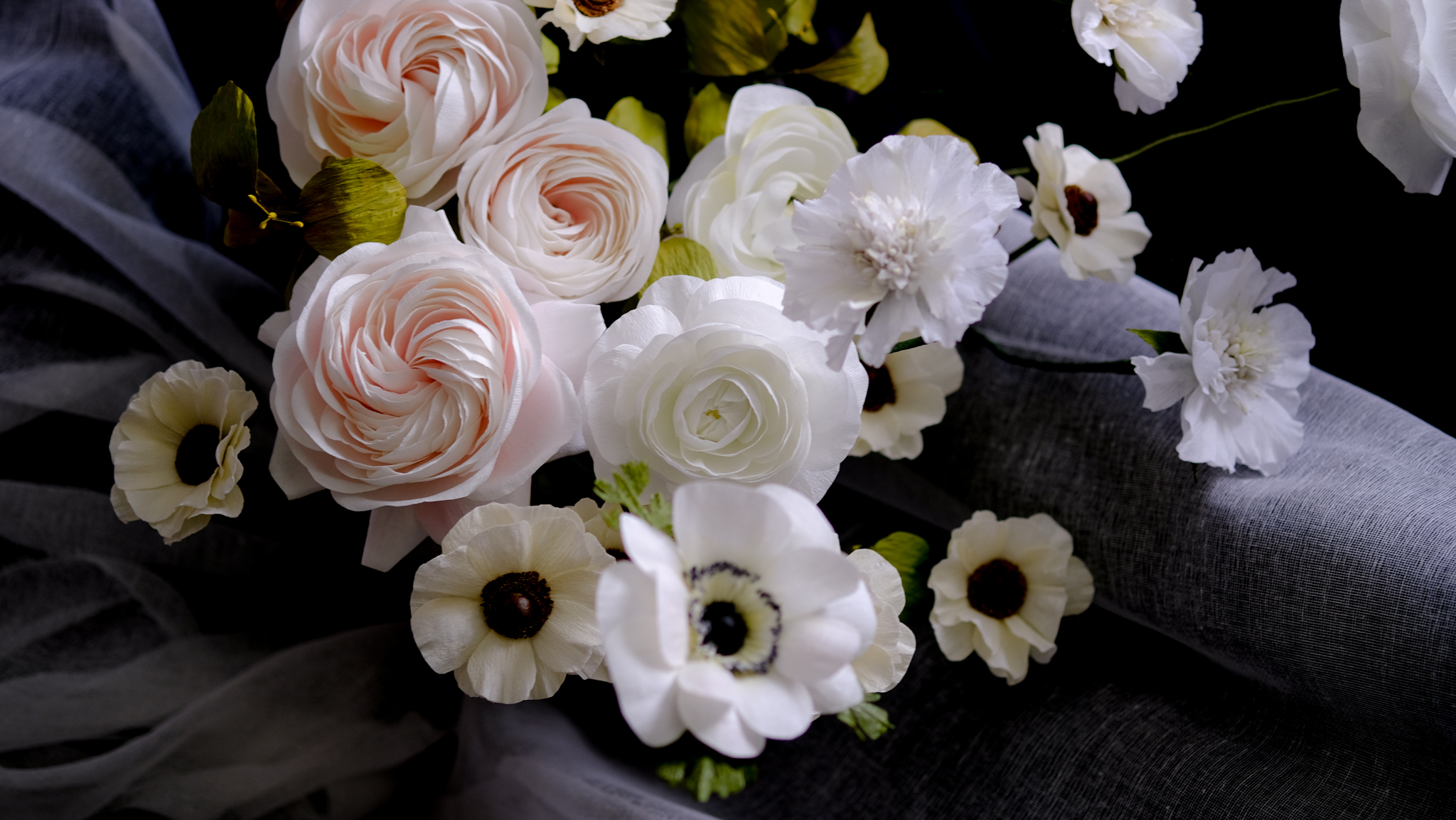
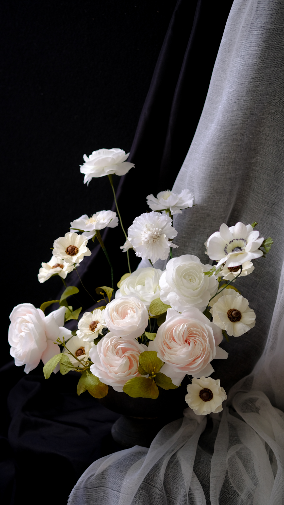
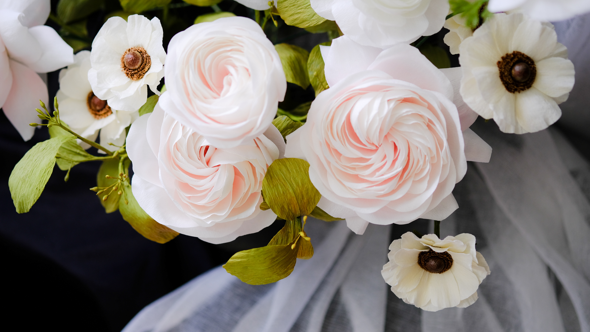
Here’s a peek at what I’ve been working on lately. I’ve been taking a needed summer break and making flowers here and there to complete a large wedding order in the fall. There are some ranunculus, Italian butterfly ranunculus, anemones, garden roses, scabiosa, and seeded eucalyptus in this photo. I’m adding more varieties of blooms and need to make dozens and dozens of more flowers, including more varieties of garden roses and some fillers.
So how do you start putting all of these flowers together in a cohesive way? How do you figure out what’s missing from an arrangement, what could improve it?
My advice is to create a pocket of air around each of your blooms. Give them space to be recognized. Similarly, create smaller pockets of stories within your arrangement so that the eye moves from one area to the next. These stories naturally lead from one to the next.
Let’s look at an example.
With the image I shared, the first thing your eye probably catches on is the top white ranunculus. Then your gaze travels down the stem to the cluster of Italian butterfly ranunculus. Automatically you want to look at a larger bloom, and the blush garden rose appears. Now the eye is following the bottom row and moving upwards to the other flowers. Notice at first glance that your eyes want to move in a counterclockwise motion—at least, that is my hope for when the viewer first sees my arrangement.
Remember that the eye is trained to move left to right, and up and down. But as you are the artist, you can control how they view your work. With some thought, you can guide a person’s experience.
Take a look at your arrangement and pay attention to where your gaze lands. Look for spots where your eye loses interest or gets lost. You may need to move things around several times until you find the right placement.
You can also consider if something is simply missing from your arrangement. Do you need more blooms? Are you missing a big flower, or do you need filler?
Another missing piece to consider is color.
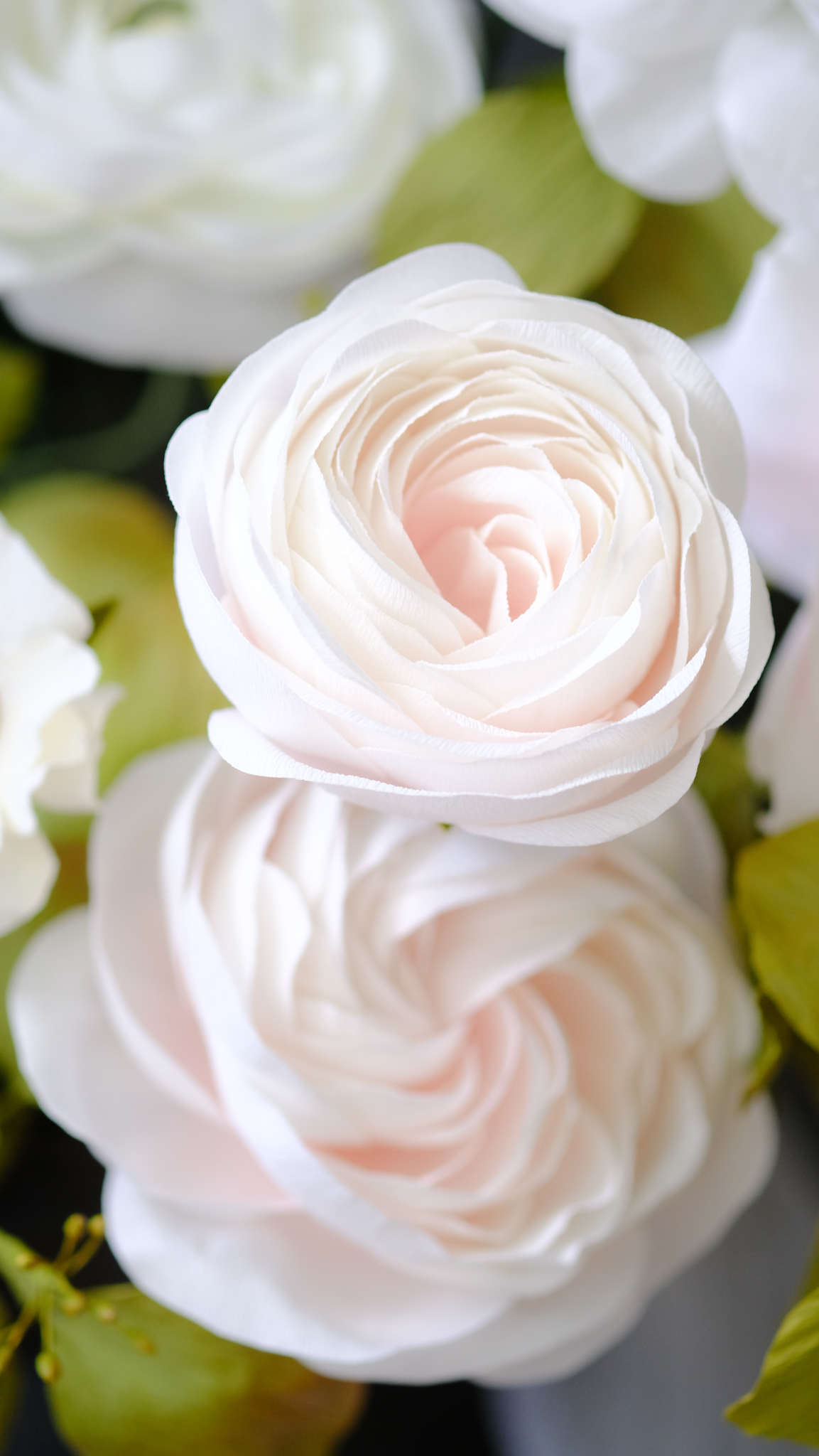
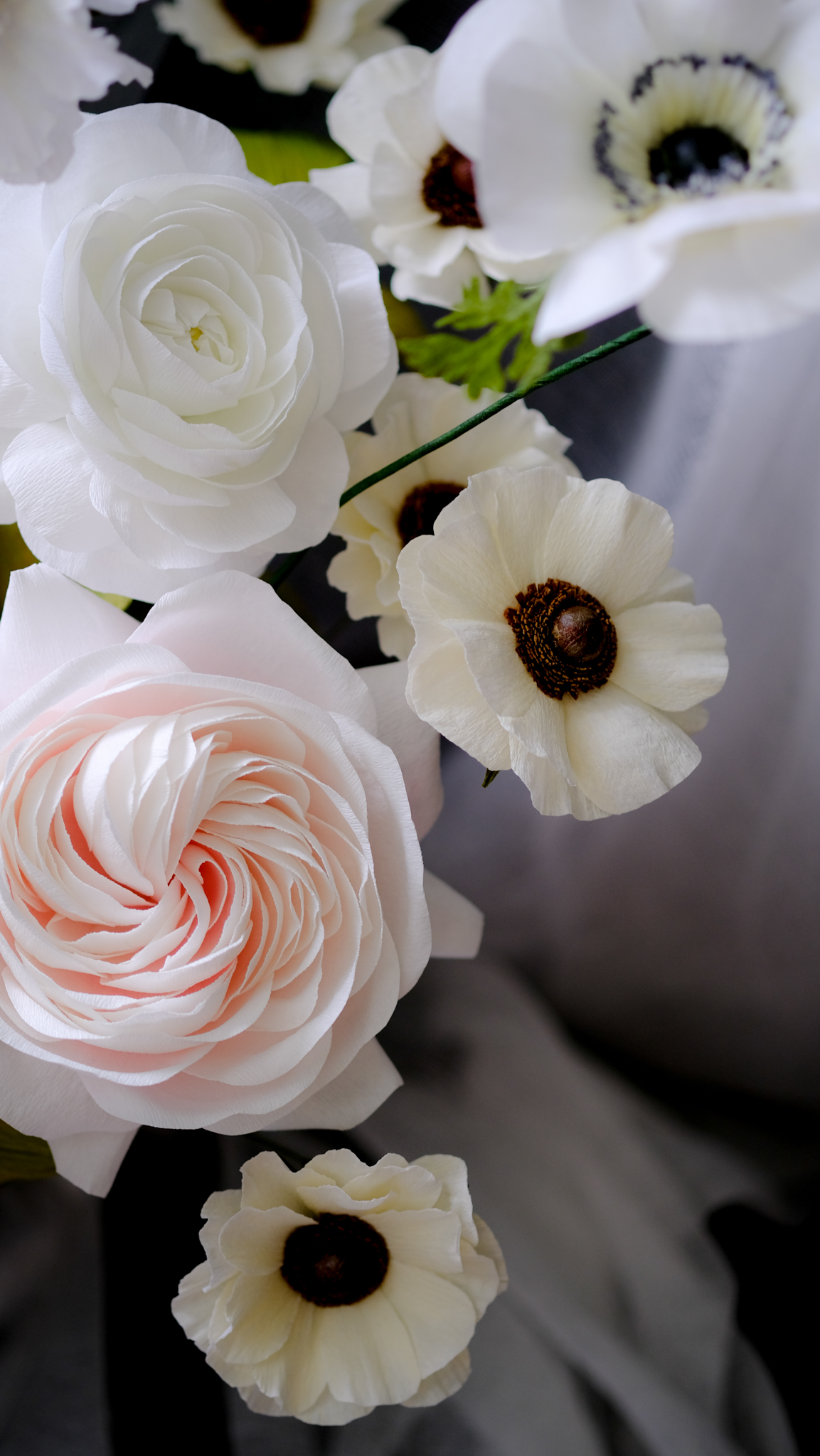
My bride asked for a white and green bouquet, a very classic wedding color choice. In the natural world, of course, a white flower isn’t a pristine sheet of printer paper. There are undertones and whispers of color that bleed along the petal edges.
I took the initiative to add a hint of pink and subtle tones to create contrast and bring more depth to each bloom. If I did make an all white flower, it would be washed out in photos. You wouldn’t be able to see the details of the bloom, and all of that hard work put into that paper flower couldn’t be admired. That’s the very last thing a paper artist wants! For white blooms, add just a hint of color at the base of the petal or make the center of the flower stand out more.
Of course, there is an entire rainbow of colors out there. Learning how to combine them is an artform itself. You can get a quick rundown of color theory and how to use it in your paper flower arrangements from this blog post. Taking the time to add more color details is your challenge from me.
Share your floral arrangements with me on Instagram by tagging @pinkandposey. I always love to see what other paper florists are creating.
Have fun and happy making!
Interested in learning more about the world of paper flowers?
Sign up for my personal newsletter
Sign up for the lates news on what I am up to, along with in-person workshops and other collaborations.
I respect your privacy and will never share your email and contact information with any third party without your permission.


